

Mastering Tonal Control
Creating a 'Flat Curve' in Adobe Photoshop
For commercial clients, consistency is every bit as important as creativity. One of the questions I am often asked, particularly by photographers who are moving into commercial work, is whether I spend a significant amount of time retouching images in Photoshop. Most of the work, especially when shooting a car photography based series of images ‘in studio’ is completed at the actual lighting and shooting stage of the process. Of course there will always be slight refinements required at the post edit stage, I have written a small guide below to help with one common adjustment process that I often need to use, small adjustments in tone to keep images accurate and also tie a series together consistently.
Whilst Photoshop undoubtedly plays an important role in my professional workflow, I would never describe myself as a retoucher. My background and passion have always centred around creating the image as accurately and effectively as possible in camera. Years spent photographing everything from high-performance automotive projects for clients, through to large-scale transport and industrial commissions have taught me that the more control you can achieve during the shoot itself, the more efficient and consistent the entire production process becomes. That said, post-production remains an essential stage of commercial photography. Not because we are trying to rescue images, but because we are refining them. More importantly, we are ensuring that a complete image set works together as a cohesive visual collection.
When a manufacturer commissions a campaign featuring multiple vehicles, or a transport company requires an extensive library of imagery for marketing and advertising purposes, every photograph needs to sit comfortably alongside the next. Tonal values, contrast, colour rendition and overall visual balance all need to feel unified. If one image drifts away from the others, even subtly, the entire collection can begin to feel disjointed.
This is rarely a major issue during studio productions. In a controlled environment I have complete authority over the lighting. Every light source is positioned with purpose, every reflection is managed, and every aspect of the image is carefully constructed. The result is a level of consistency that is relatively straightforward to maintain. The challenge often comes later.
When working through a series of images during post-production, there are occasions where adjustments need to be made to improve tonal balance, recover detail or refine contrast. However, these corrections can sometimes create a problem of their own. In making a tonal adjustment, you may inadvertently alter the colour values within that same area of the image.
For many subjects this may not be immediately noticeable. For commercial work, however, particularly where brand colours or product finishes are critical, even a subtle shift can become a significant issue.
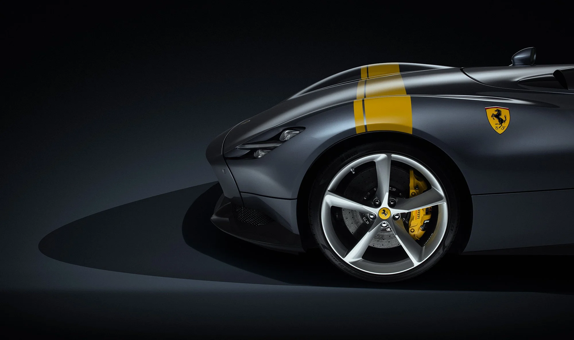
A perfect example came during a recent Ferrari Monza project. More images from this shoot can be viewed in our Automotive Portfolio.
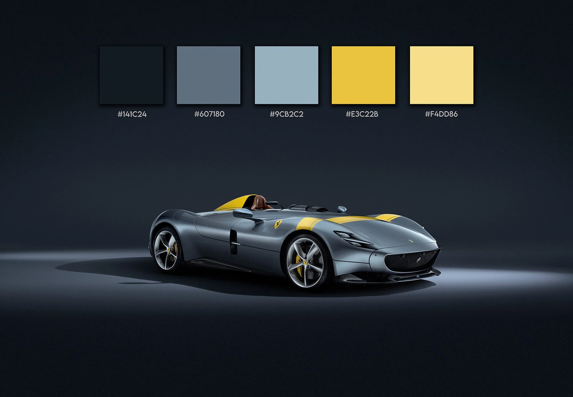
At first glance, silver might seem like one of the easiest colours to work with. In reality, it can be one of the most unforgiving. Metallic silver surfaces are highly reflective and incredibly responsive to surrounding light conditions. Small changes in contrast or luminosity can quickly introduce unwanted colour shifts. Areas that should remain neutral can suddenly appear warmer, cooler, slightly blue or slightly magenta.
When viewing a single image in isolation, those changes may seem insignificant. Place that image alongside ten others from the same shoot, however, and inconsistencies immediately begin to reveal themselves.
This becomes particularly important when producing image sets for manufacturers and commercial clients who demand accuracy. The vehicle needs to look like the same vehicle throughout the entire collection. The paint tone must remain consistent. The visual identity of the product must remain intact.
Over the years I have developed a number of techniques to help maintain that consistency, but one method in particular has become a regular part of my workflow whenever I need to make tonal adjustments without affecting core colour values. This is often critical in commercial and product photography and is something that many can often overlook.
I often refer to it simply as the "Flat Curve" technique.
What makes this approach so useful is its ability to separate tonal correction from colour influence. Rather than making an adjustment that simultaneously impacts both luminosity and colour information, this method allows you to focus specifically on the tonal characteristics of an image while preserving the underlying colour relationships.
The result is a much greater degree of control. It enables subtle refinements to shadows, mid-tones and highlights whilst maintaining the integrity of the original colour palette, for automotive photography, transport imagery and product work where colour accuracy is critical, that level of precision can make a significant difference. Perhaps more importantly, it provides consistency. When working through dozens, sometimes hundreds, of images from a commercial assignment, having a reliable method that produces predictable results is invaluable. It reduces the likelihood of introducing colour discrepancies and helps ensure that the final image collection maintains a coherent and professional appearance.
As with any workflow technique, I would strongly recommend experimenting with it yourself. Open a variety of images and test how it behaves across different subjects and lighting conditions. You'll quickly gain an understanding of where it excels and how it might fit into your own editing process.
If you find it useful, one of the simplest ways to integrate it into your workflow is to record it as a Photoshop Action. Having the setup available at the click of a button can save considerable time, particularly when processing larger image sets. The key point to remember is that every image will require its own adjustment values, so I generally recommend recording the Action only up to the stage immediately before the actual tonal corrections are made. This provides a ready-made framework that can be applied instantly while still allowing the flexibility to tailor the final adjustments to the specific requirements of each image.
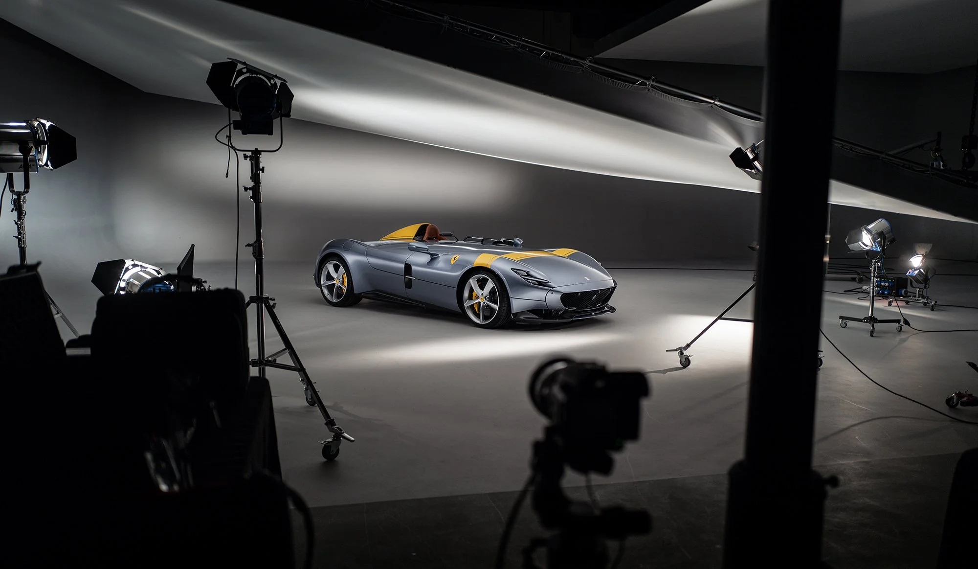
The image below is a behind the scenes capture taken during the Ferrari Monza SP1 shoot that took place in studio in the UK.
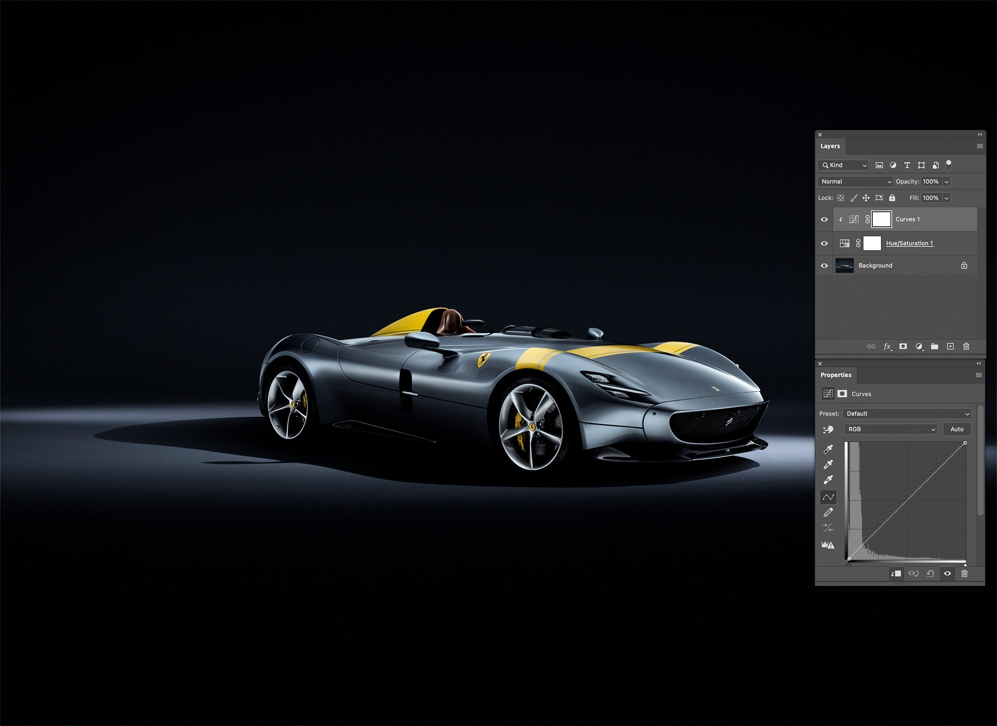
The Method
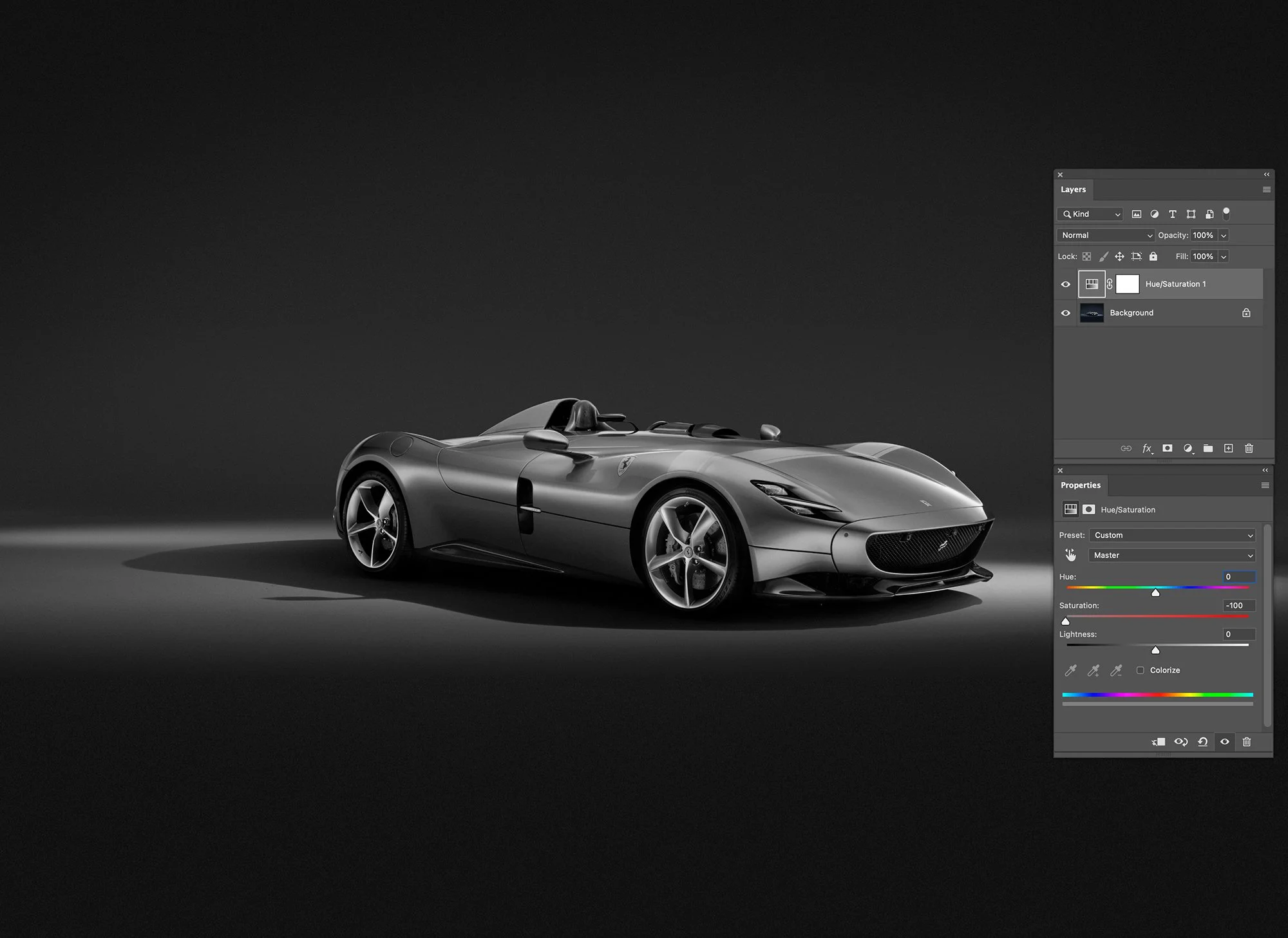
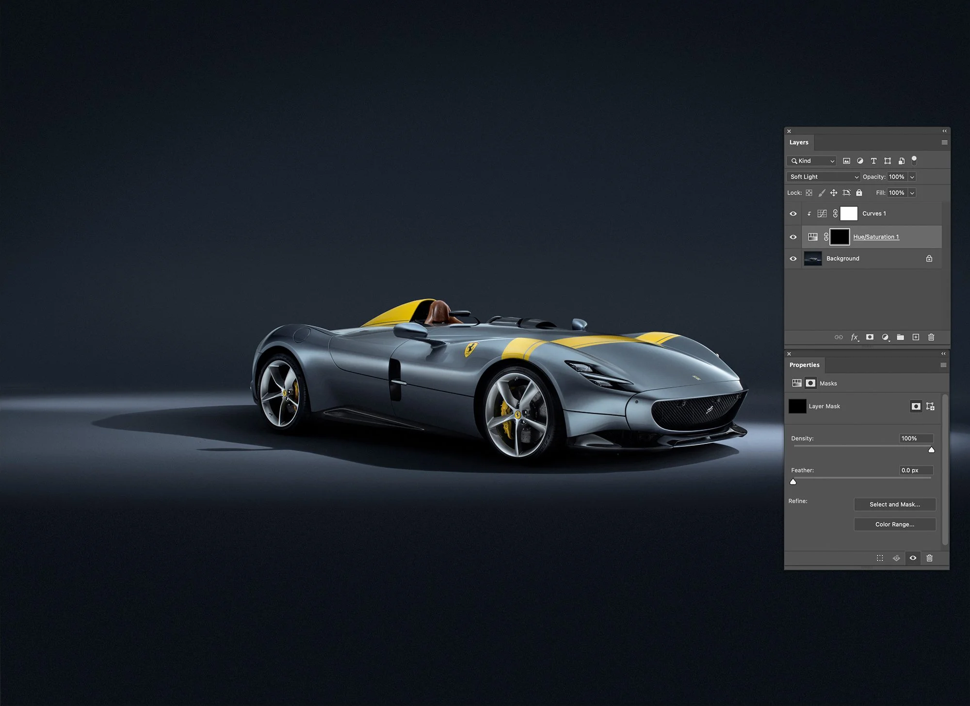
Step 1 - Create a Hue Saturation Adjustment layer that will show in the layers stack above your original image. Once done, open this and take the saturation all the way down to zero.
Now make the blend mode for that layer > Soft Light
Step 2 - Then make a Curves adjustment above that, make sure that you 'clip' it to the layer below (The Hue Adjustment one) by clicking on it while holding the ALT key (Mac).
A small arrow will appear on the left of the layer to show its clipped to the layer underneath and will only affect that.
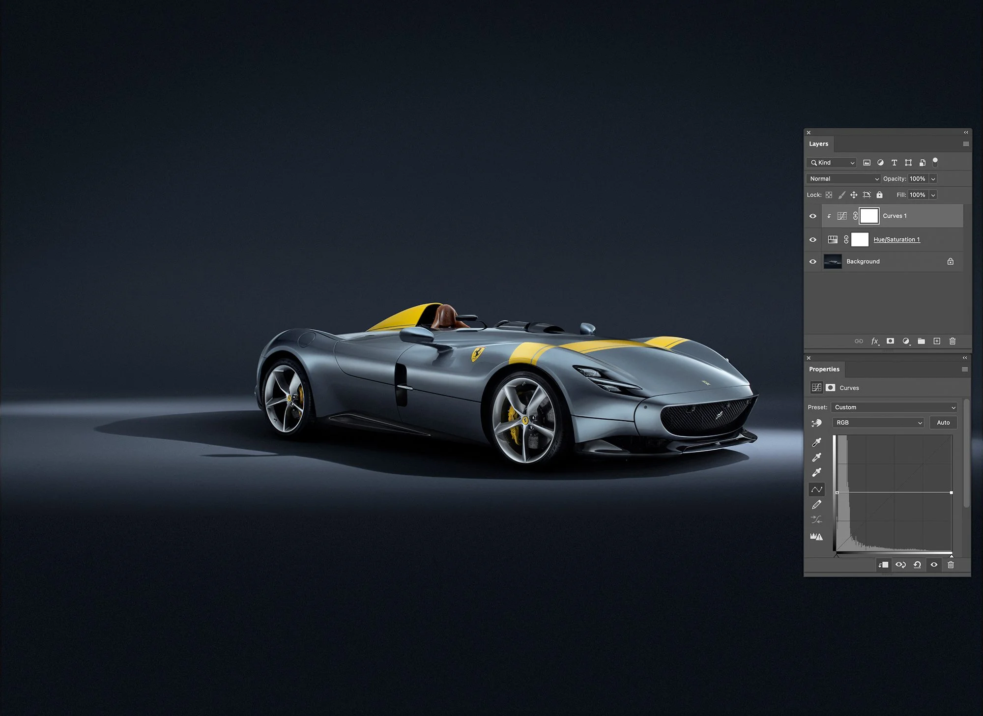
Step 3 - Open the curves adjustment layer and you are going to grab the left and right far points of the curve and move them so that you have a flat line in the middle of the graph.
You can now use the flat line to make small changes to the brightness tonally along from the darkest point (far left) to the lightest point (far right)
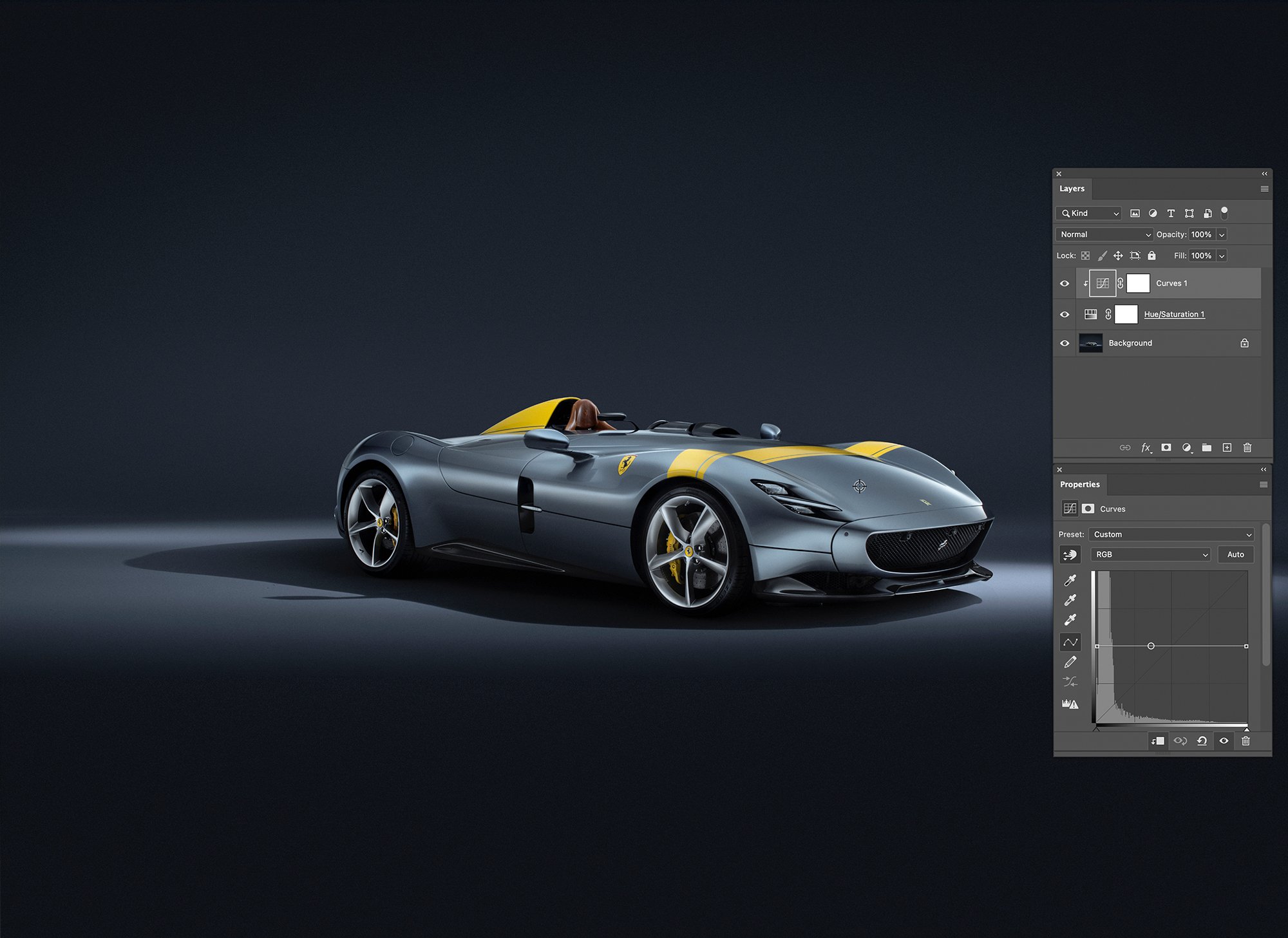
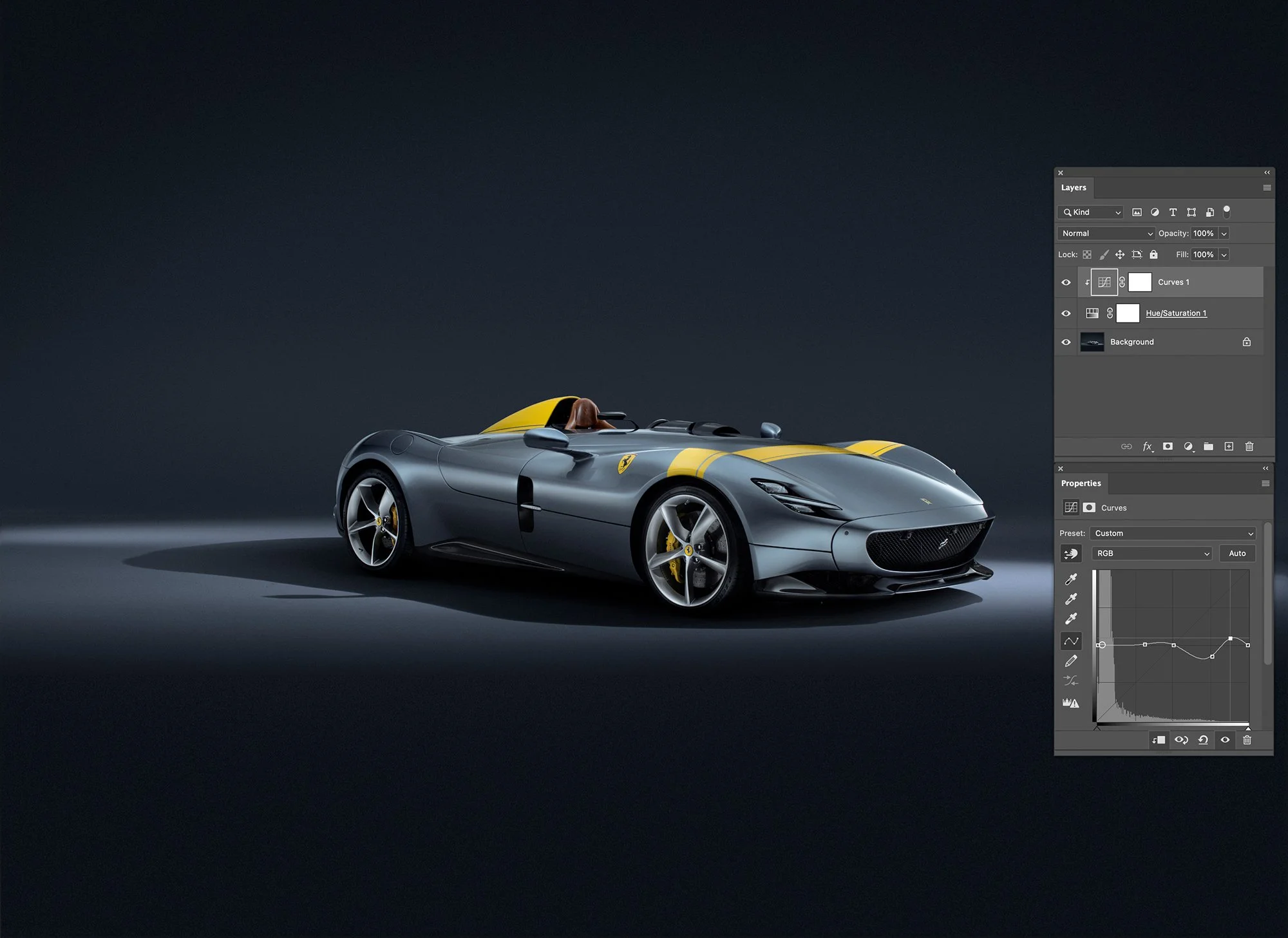
Step 4 - One way of doing this for certain points could be to use the 'Click and drag' option that is on the curves adjustment window (just below the word pre-set, the hand icon with the up and down arrows on it) Click this and then take the eyedropper over onto your image, select a tonal range you want to modify and its tonal value will appear as a dot along your curves adjustment graph line. Then you can pull this point on the graph and make your changes. Any changes that you make will adjust this tonal area.
Step 5 - You may wish to click several points along the flat line before you start making adjustments if you wish the changes to be very localised and prevent the left and right of your curve line bending in other directions as you pull it around.
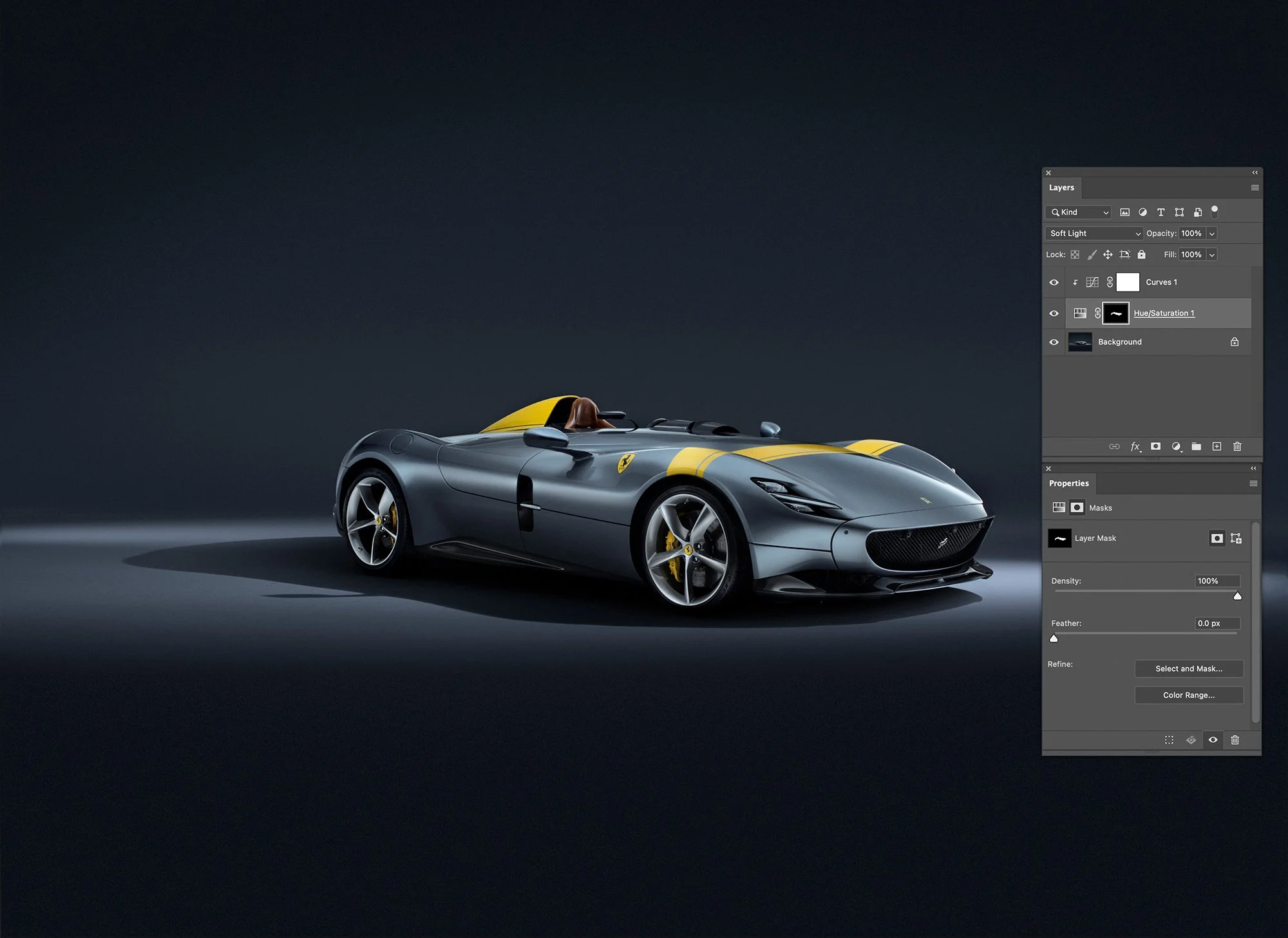
Step 6 - Finally note that the Hue/Saturation adjustment layer has a mask, and you may want to 'Invert' this so that it turns black (Click on mask and hit CMD I)
Step 7 – You can then use a white brush to 'paint in' the tonal changes you have made but keep them to localised areas on the image.
What you now have is the ability to make changes to that curve line at any points along it and those changes will affect the tone, brightness, darkness etc but will NOT have any effect on the colour of your original image.
It is a small technique, but one that has proved extremely valuable throughout my commercial workflow. Whether photographing transport fleets, industrial machinery, luxury automotive subjects or complex product commissions, maintaining colour consistency while refining tonal balance is something that I encounter on almost every project.
Often it is the smallest workflow improvements that deliver the greatest long-term benefits, and this is certainly one of those techniques.